
Personal Analytics Part 1: Gmail
Most of us are sending or receiving tens to hundreds of emails daily. I have been using email regularly since my undergrad days in 2008 so I thought it would be a neat project to download my gmail data and analyze it to find out any interesting trends.
This post will detail the exploration of my Gmail account going back to 2018 but the code should be applicable (with some minor modifications) to your emails as well!
Read in Data and explore
Get mbox data here. Note that we only deal with Gmail data here. If you can get your email into mbox format then this should probably work as well but the tags may be different.
# set raw data mbox path
mboxfile = 'gmail/Mail/All mail Including Spam and Trash.mbox'
Use mailbox.mbox to read in the mailbox data. This will essentially return a list of dictionaries for each email. We will see what the dictionary contains in the next step.
# read in mbox
mbox = mailbox.mbox(mboxfile)
Lets loop over the keys to see what Google keeps track of. If you are doing this on your mailbox you can take a look at all the values as well, I just don't want to accidentally post secure values on my blog!!
for key in mbox[0].keys():
    print(key)
X-GM-THRID
X-Gmail-Labels
Delivered-To
Received
X-Google-Smtp-Source
X-Received
ARC-Seal
ARC-Message-Signature
ARC-Authentication-Results
Return-Path
Received
Received-SPF
Authentication-Results
Date
DKIM-Signature
From
To
Message-ID
Subject
Mime-Version
Content-Type
Content-Transfer-Encoding
X-Auto-Response-Suppress
For the purposes of this analysis we really only want to keep Subject, To, From, Date, and X-Gmail-Labels. The first four are self explanatory and the last will tell us if the message was in "Sent" mail or in my inbox. We will also keep X-GM-THIRD which is a variable that keeps track of email threads.
Convert to csv
So to simplify our lives, lets make a csv containing only those value for all of the messages. After this, we can use pandas to read the csv into a dataframe.
with open("mbox.csv", "w") as outfile:
    writer = csv.writer(outfile)
    for message in mbox:
        writer.writerow([message['subject'], message['from'], message['date'], message['to'],
                         message['X-Gmail-Labels'], message['X-GM-THRID']])
Read in the csv using read_csv and give the headers manually since mbox.csv doesn't have any headers. We also convert the date to a datetime object.
df = pd.read_csv('mbox.csv', names=['subject', 'from', 'date', 'to', 'label', 'thread'])
df['date'] = df['date'].apply(lambda x: pd.to_datetime(x, errors='coerce', utc=True))
df = df[df['date'].notna()]
Now lets print out some basic info. It looks like I have 72,728 emails from my gmail account (I'm actually disappointed I haven't collected more over the 10 years that I've been using gmail.). We can also see that there are some null values for each of the variables but we will deal with those in turn.
df.info()
<class 'pandas.core.frame.DataFrame'>
Int64Index: 72554 entries, 0 to 72727
Data columns (total 6 columns):
subject    72238 non-null object
from       72554 non-null object
date       72554 non-null datetime64[ns, UTC]
to         72337 non-null object
label      63443 non-null object
thread     72554 non-null int64
dtypes: datetime64[ns, UTC](1), int64(1), object(4)
memory usage: 3.9+ MB
Now that we know the basic metadata, lets look at the first 5 rows of our dataframe.
df.head()
.dataframe tbody tr th {
    vertical-align: top;
}

.dataframe thead th {
    text-align: right;
}
| subject | from | date | to | label | thread | |
|---|---|---|---|---|---|---|
| 0 | ChiaraMingarelli invited you to ChiaraMingarel... | Chiara Mingarelli <noreply@github.com> | 2017-12-11 22:05:04+00:00 | Justin Ellis <justin.ellis18@gmail.com> | Inbox | 1586526845691397288 |
| 1 | UA Tech T: Stay Cool, Dry & Light For Only $20 | "Under Armour" <underarmour@emails.underarmour... | 2017-12-12 14:12:55+00:00 | <justin.ellis18@gmail.com> | Unread | 1586587953494846507 |
| 2 | Fwd: arXiv New submission -> 1712.03549 in ast... | Hyungsuk Tak <hyungsuk.tak@gmail.com> | 2017-12-12 02:29:22+00:00 | Sujit Ghosh <sujit.ghosh@ncsu.edu>, Justin Ell... | Important,Inbox | 1586543475500619677 |
| 3 | RE: arXiv New submission -> 1712.03549 in astr... | Sujit Ghosh <sghosh2@ncsu.edu> | 2017-12-12 02:39:18+00:00 | Hyungsuk Tak <hyungsuk.tak@gmail.com>, \r\n\tJ... | Important,Inbox | 1586543475500619677 |
| 4 | Become a CFI Secular Celebrant this January | "Center for Inquiry" <enews@centerforinquiry.net> | 2017-12-22 14:27:59+00:00 | "Justin Ellis" <justin.ellis18@gmail.com> | Trash | 1587494656383171641 |
The first important thing to notice here is that the "to" and "from" values take on an array of different types. Some of them just have the email address in angle brackets, others have the name and then email address in brackets, sometimes the name is in quotes, and in other cases there are a list of email names and addresses.
We will try to clean this up as much as possible. The first thing to notice is that for our purposes we only need to concentrate on the "from" label to determine if an email was sent or received. If my email is in the "from" column then we will mark it as sent and if not then it is received. For this reason, we also don't need the gmail labels since they are not that informative with labels like "Important,Inbox", "Inbox", "Important", "Unread, Important, Inbox", etc. We can just use the method above to mark an email message as either "Sent" or "Inbox".
First we want a way to remove the names from the email addresses as these are not unique but the actual email addresses are. If you know that you send or receive emails from someone that has multiple accounts then you may need to do more but this will not be a large problem for me here.
The function below uses a regular expression to pull out the email address inside the angle brackets. The if-statement is needed in the rare cases that the "from" variable is just an email string instead of one encased in angle brackets. If no email address if found then we return NaN.
def get_email_address(string):

    email = re.findall(r'<(.+?)>', string)
    if not email:
        email = list(filter(lambda y: '@' in y, string.split()))
    return email[0] if email else np.NAN
Now, lets apply this function to the "from" column, drop the "to" column and simplify the "label" column.
# apply to from column
df['from'] = df['from'].apply(lambda x: get_email_address(x))

# if email is from me, then it is sent, otherwiese it is in Inbox
me = 'justin.ellis18@gmail.com'
df['label'] = df['from'].apply(lambda x: 'sent' if x==me else 'inbox')

# drop "to" column
df.drop(columns='to', inplace=True)
Lets take a look at our cleaned up data frame. Much better!
df.head()
.dataframe tbody tr th {
    vertical-align: top;
}

.dataframe thead th {
    text-align: right;
}
| subject | from | date | label | thread | |
|---|---|---|---|---|---|
| 0 | ChiaraMingarelli invited you to ChiaraMingarel... | noreply@github.com | 2017-12-11 22:05:04+00:00 | inbox | 1586526845691397288 |
| 1 | UA Tech T: Stay Cool, Dry & Light For Only $20 | underarmour@emails.underarmour.com | 2017-12-12 14:12:55+00:00 | inbox | 1586587953494846507 |
| 2 | Fwd: arXiv New submission -> 1712.03549 in ast... | hyungsuk.tak@gmail.com | 2017-12-12 02:29:22+00:00 | inbox | 1586543475500619677 |
| 3 | RE: arXiv New submission -> 1712.03549 in astr... | sghosh2@ncsu.edu | 2017-12-12 02:39:18+00:00 | inbox | 1586543475500619677 |
| 4 | Become a CFI Secular Celebrant this January | enews@centerforinquiry.net | 2017-12-22 14:27:59+00:00 | inbox | 1587494656383171641 |
Convert times
Before we start our actual analysis we want to convert the timestamps and add some auxiliary variables. We will do the following
- Convert all times from UTC to "local" timezones. I have made a special function to take into account the time periods where I lived in Milwaukee and Pasadena in order to get approximately "local" times. I don't take into account various trips.
- Create a "dayofweek" variable that is a string for the weekday name (i.e., 'Monday')
- Create a "timeofday" variable that is a fraction of the 24 hour day
- Create a "year" variable that is a fraction of a 365.25 day year (i.e., 2015.14)
Lastly, we will index our dataframe by date and delete the "date" variable. I'll note that there is almost certainly a better way of converting these times and plotting by time but datetime is a mystery to me.
# convert to Eastern time zone
def convert_tz(x):

    # milwaukee
    mstart = datetime.datetime(2011, 7, 4, tzinfo=pytz.utc)
    mstop = datetime.datetime(2014, 8, 15, tzinfo=pytz.utc)

    # pasadena
    pstart = datetime.datetime(2014, 8, 15, tzinfo=pytz.utc)
    pstop = datetime.datetime(2017, 7, 1, tzinfo=pytz.utc)

    if mstart < x < mstop:
        cst = pytz.timezone('US/Central')
        return x.astimezone(cst)

    elif pstart < x < pstop:
        pst = pytz.timezone('US/Pacific')
        return x.astimezone(pst)

    else:
        est = pytz.timezone('US/Eastern')
        return x.astimezone(est)


df['date'] = df['date'].apply(lambda x: convert_tz(x))

# weekday name
df['dayofweek'] = df['date'].apply(lambda x: x.weekday_name)
df['dayofweek'] = pd.Categorical(df['dayofweek'], categories=[
    'Monday', 'Tuesday', 'Wednesday', 'Thursday', 'Friday',
    'Saturday', 'Sunday'], ordered=True)

# time of day
df['timeofday'] = df['date'].apply(lambda x: x.hour + x.minute/60 + x.second/3600)

# hour
df['hour'] = df['date'].apply(lambda x: x.hour)

# year integer
df['year_int'] = df['date'].apply(lambda x: x.year)

# year fraction
df['year'] = df['date'].apply(lambda x: x.year + x.dayofyear/365.25)

# set date to index
df.index = df['date']
del df['date']
Analysis
Our data is now nice and cleaned so lets start to take a look at some of the basic characteristics.
print(df.index.min().strftime('%a, %d %b %Y %I:%M %p'))
print(df.index.max().strftime('%a, %d %b %Y %I:%M %p'))
print('\n')
print(df['label'].value_counts())
Wed, 03 Dec 2008 12:47 PM
Fri, 05 Jan 2018 04:55 PM


inbox    61813
sent     10741
Name: label, dtype: int64
The email history in this file starts on Wednesday December 3rd, 2008 and ends on Friday January 5, 2018 so we have a little over 9 years of email data on hand. I don't actually remember when I first set up my Gmail account but I had been using various university email servers before that. Furthermore I have about a 6:1 received to sent ratio with 61,813 emails received and 10,741 emails sent over that time period.
Lets take a look at what time of day I send and receive emails over my Gmail history.
def plot_tod_vs_year(df, ax, color='C0', s=0.5, title='', add_milwaukee=False, add_pasadena=False):

    ind = np.zeros(len(df), dtype='bool')
    est = pytz.timezone('US/Eastern')
    if add_milwaukee:
        start = datetime.datetime(2011, 7, 4, tzinfo=est)
        stop = datetime.datetime(2014, 8, 15, tzinfo=est)
        idx = np.logical_and(df.index>start, df.index<stop)
        ind += idx
        df[idx].plot.scatter('year', 'timeofday', s=s, alpha=0.6, ax=ax, color='C3')

    if add_pasadena:
        start = datetime.datetime(2014, 8, 15, tzinfo=est)
        stop = datetime.datetime(2017, 7, 1, tzinfo=est)
        idx = np.logical_and(df.index>start, df.index<stop)
        ind += idx
        df[idx].plot.scatter('year', 'timeofday', s=s, alpha=0.6, ax=ax, color='C2')

    df[~ind].plot.scatter('year', 'timeofday', s=s, alpha=0.6, ax=ax, color=color)
    ax.set_ylim(0, 24)
    ax.yaxis.set_major_locator(MaxNLocator(8))
    ax.set_yticklabels([datetime.datetime.strptime(str(int(np.mod(ts, 24))), "%H").strftime("%I %p")
                        for ts in ax.get_yticks()]);

    ax.set_xlabel('')
    ax.set_ylabel('')
    ax.set_title(title)
    ax.grid(ls=':', color='k')

    return ax
sent = df[df['label']=='sent']
recvd = df[df['label']=='inbox']

fig, ax = plt.subplots(nrows=1, ncols=2, figsize=(15, 4))

plot_tod_vs_year(sent, ax[0], title='Sent', add_milwaukee=True, add_pasadena=True)
plot_tod_vs_year(recvd, ax[1], title='Received', add_milwaukee=True, add_pasadena=True)
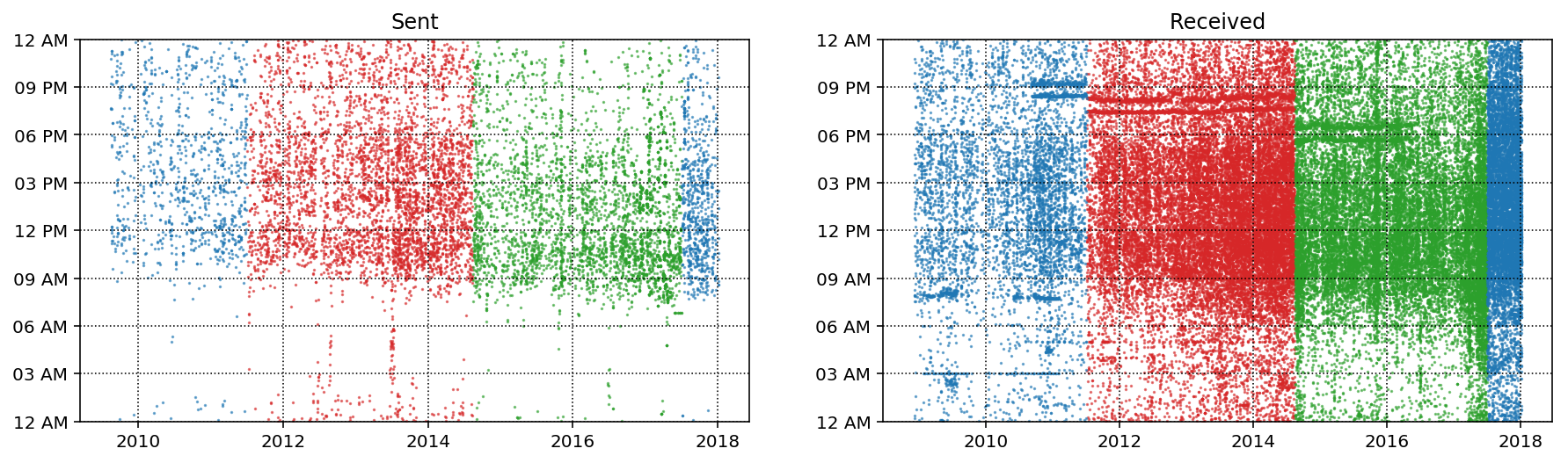
There are lot of things to notices in the plots above. First off, the red points indicate the time that I spend during my Ph.D in Milwaukee and the green points are the time that I spend in Pasadena during my postdoc. Overall there is a slight trend towards starting earlier and you can see that my schedule started to change at the end of my Post-doc as I started to get up earlier and thus started sending emails earlier. Another cool feature is the line in the "Sent" plot around mid 2013. During this time I was on a month long trip around the world with 2 weeks in Thailand, one in England and one in Poland so it makes sense that I would be sending emails very early in EST. In general it looks like I don't send many emails before 8 am and slow down around 5 or 6. You can just make out that there is definitely a lower density of emails after 4:30-5:00 after my Ph.D as I try to have more of a work-life balance nowadays.
In the "Received" plot trends are a bit harder to make out without splitting it by sender (which we will do in a second). One feature is that a lot of the received emails in my Pasadena years are not significantly delayed which indicates that the majority of senders are also in the Pacific time zone. You can also see the two email lists (around 8:30 and 9 PM, and dropping with time zone) which are the arxiv emailers for astro-ph and gr-qc. I stopped subscribing to those in early 2017 which you can also see.
There are definitely some interesting trends here. Lets break things down a bit further
Incoming vs. Outgoing trends
Lets take a look at hour my incoming and outgoing mail evolved over the 2009-2018 period and also how it evolves over a day (averaged over total usage back to 2009).
To do this we will need to write a few plotting functions:
plot_count_vs_year: Plots average number of emails per day as function of yearplot_count_vs_tod: Plots average number of emails per hour as function of time of day (over total email history)TriplePlot: Class that creates plot of time-of-day vs year for all emails as well as the above two plots.
def plot_count_vs_year(df, ax, label=None, dt=0.3, **plot_kwargs):
    """Plot average number of emails per day as a function of year."""

    year = df[df['year'].notna()]['year'].values
    T = year.max() - year.min()
    bins = int(T / dt)
    weights = 1 / (np.ones_like(year) * dt * 365.25)
    ax.hist(year, bins=bins, weights=weights, label=label, **plot_kwargs);
    ax.grid(ls=':', color='k')
def plot_count_vs_tod(df, ax, label=None, dt=1, smooth=False,
                      weight_fun=None, **plot_kwargs):
    """Plot average number of emails per hour as a function of time of day."""

    tod = df[df['timeofday'].notna()]['timeofday'].values
    year = df[df['year'].notna()]['year'].values
    Ty = year.max() - year.min()
    T = tod.max() - tod.min()
    bins = int(T / dt)
    if weight_fun is None:
        weights = 1 / (np.ones_like(tod) * Ty * 365.25 / dt)
    else:
        weights = weight_fun(df)
    if smooth:
        hst, xedges = np.histogram(tod, bins=bins, weights=weights);
        x = np.delete(xedges, -1) + 0.5*(xedges[1] - xedges[0])
        hst = gaussian_filter(hst, sigma=0.75)
        f = interp1d(x, hst, kind='cubic')
        x = np.linspace(x.min(), x.max(), 10000)
        hst = f(x)
        ax.plot(x, hst, label=label, **plot_kwargs)
    else:
        ax.hist(tod, bins=bins, weights=weights, label=label, **plot_kwargs);


    ax.grid(ls=':', color='k')
    orientation = plot_kwargs.get('orientation')
    if orientation is None or orientation == 'vertical':
        ax.set_xlim(0, 24)
        ax.xaxis.set_major_locator(MaxNLocator(8))
        ax.set_xticklabels([datetime.datetime.strptime(str(int(np.mod(ts, 24))), "%H").strftime("%I %p")
                            for ts in ax.get_xticks()]);
    elif orientation == 'horizontal':
        ax.set_ylim(0, 24)
        ax.yaxis.set_major_locator(MaxNLocator(8))
        ax.set_yticklabels([datetime.datetime.strptime(str(int(np.mod(ts, 24))), "%H").strftime("%I %p")
                            for ts in ax.get_yticks()]);
class TriplePlot:
    """
    Plot a combination of emails as a function of time and year,
    average emails per day vs year and average number of
    emails per hour vs. time of day.
    """

    def __init__(self):

        gs = gridspec.GridSpec(6, 6)

        self.ax1 = plt.subplot(gs[2:6, :4])

        self.ax2 = plt.subplot(gs[2:6, 4:6], sharey=self.ax1)
        plt.setp(self.ax2.get_yticklabels(), visible=False);

        self.ax3 = plt.subplot(gs[:2, :4])
        plt.setp(self.ax3.get_xticklabels(), visible=False);

    def plot(self, df, color='darkblue', alpha=0.8, markersize=0.5, yr_bin=0.1, hr_bin=0.5):

        plot_tod_vs_year(df, self.ax1, color=color, s=markersize)
        plot_count_vs_tod(df, self.ax2, dt=hr_bin, color=color, alpha=alpha,
                          orientation='horizontal')
        self.ax2.set_xlabel('Average emails per hour')
        plot_count_vs_year(df, self.ax3, dt=yr_bin, color=color, alpha=alpha)
        self.ax3.set_ylabel('Average emails per day')
plt.figure(figsize=(12,12));
tpl = TriplePlot()

tpl.plot(recvd, color='C0', alpha=0.5)
tpl.plot(sent, color='C1', alpha=0.5)
p1 = mpatches.Patch(color='C0', label='Incoming', alpha=0.5)
p2 = mpatches.Patch(color='C1', label='Outgoing', alpha=0.5)
plt.legend(handles=[p1, p2], bbox_to_anchor=[1.45, 0.7], fontsize=14, shadow=True);
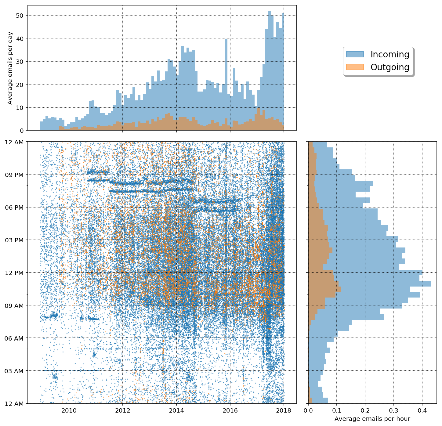
In the plot above we get a good summary of aggregate values both as a function of year and time of day. The first obvious point is that there are many more incoming emails than outgoing emails at all times. It is also clear that I've had peaks in sent emails in the high point of my Ph.D research in late 2013 into mid 2014 and also at the beginning of 2017. During the last year of my Ph.D I was scrambling to get lots of research finished for my thesis and at the beginning of last year I was trying to finish up projects (thus sending lots of emails) getting ready for job hunting. Also, my peak email time seems to be around 10:00 am and 2:30 pm and there is a dip around lunch time. Basically you can expect to almost never expect to get an email from me before 7:00 am but don't be surprised to get plenty around midnight!
In terms of incoming mail there are also two large peaks, one around late 2014 and other around early 2017. The first peak has to do with finishing my Ph.D and then the subsequent drop in emails after I started my Post-doc. The second peak corresponds to a GitHub notification emailer as we will see next.
Who do I communicate with?
It is interesting to see who I communicate with the most. A simple way to do this is to just sort by the value counts of the email addresses. Of course this only received emails since we are not tackling the problem of sorting out multiple recipients here. Nonetheless, this is a good proxy.
addrs = recvd['from'].value_counts()
plt.figure(figsize=(12,12));
tpl = TriplePlot()

labels = []
colors = ['C{}'.format(ii) for ii in range(9)]
idx = np.array([1,2,3,7])
for ct, addr in enumerate(addrs.index[idx]):
    tpl.plot(df[df['from'] == addr], color=colors[ct], alpha=0.3, yr_bin=0.5, markersize=1.0)
    labels.append(mpatches.Patch(color=colors[ct], label=email_dict[addr], alpha=0.5))
plt.legend(handles=labels, bbox_to_anchor=[1.4, 0.9], fontsize=12, shadow=True);
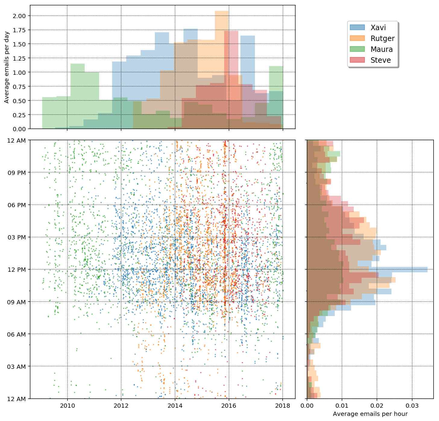
The plot above is actually really cool! We can see the different "eras" of my career by looking at who I correspond most with as a function of year. At the start of my email history is when my graduate advisor was Maura and thus she is the top correspondent in those years. In 2011 I went to UWM and my graduate advisor was Xavi and he was my main email correspondent from 2011-2014. I still have a large correspondence with Xavi partly because he is heading up our collaborations so I get a lot of emails from him anyway, nonetheless you can see a sharp drop in mid 2014 when I moved to Pasadena for my postdoc. From about mid 2012 to 2016 I had a lot of correspondence with Rutger. We worked closely while I was in Milwaukee and then we were both in Pasadena together from 2014 - 2016 so he was a major correspondent then. He left the field in early 2016 and you can see a sharp drop in email correspondence. I also started working with Steve at the end of my time in Milwaukee and then we were both in Pasadena together and thus he was a main correspondent from 2014 - present. Our email has dropped off in the last 1.5 years, however because we have started using Slack!
Thee isn't to much information to glean from the email count vs hour other than peak time are approximately 9am - 6pm. There is one thing that is interesting in that there is a peak in emails between me, Steve, and Rutger around late 2015. At this time we had a potential Gravitational Wave candidate in the data we were analyzing and thus had a huge email chain related to this. Side note: it was not a gravitational wave!
What are my most active days?
So far we have looked at emails separated by time-of-day or by year but not by day. I could be interesting to see which days are my most active email days in terms of incoming and outgoing mail.
sdw = sent.groupby('dayofweek').size() / len(sent)
rdw = recvd.groupby('dayofweek').size() / len(recvd)

df_tmp = pd.DataFrame(data={'Outgoing': sdw, 'Incoming':rdw})
df_tmp.plot(kind='bar', rot=45, figsize=(8,5), alpha=0.5)
plt.xlabel('');
plt.ylabel('Fraction of weekly emails');
plt.grid(ls=':', color='k', alpha=0.5)
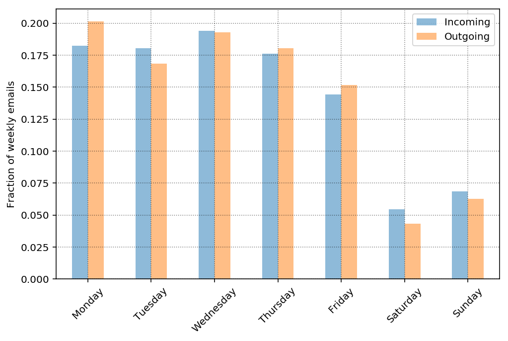
So it looks like my daily email load is pretty even among incoming and outgoing per day (as fraction of emails per week, there are way more incoming than outgoing overall). It also looks like my daily email load is approximately equal Monday - Thursday, a bit lower on Friday and significantly lower on Saturday and Sunday. We can guess that the email load is lower on Friday because there are fewer emails later in the day than during other weekdays. Furthermore, we can guess that the opposite is true on Sunday in that there may be more emails later in the day in preparation for the week ahead. So lets take a look at email as a function of hour.
plt.figure(figsize=(8,5))
ax = plt.subplot(111)
for ct, dow in enumerate(df.dayofweek.cat.categories):
    df_r = recvd[recvd['dayofweek']==dow]
    weights = np.ones(len(df_r)) / len(recvd)
    wfun = lambda x: weights
    plot_count_vs_tod(df_r, ax, dt=1, smooth=True, color=f'C{ct}',
                      alpha=0.8, lw=3, label=dow, weight_fun=wfun)

    df_s = sent[sent['dayofweek']==dow]
    weights = np.ones(len(df_s)) / len(sent)
    wfun = lambda x: weights
    plot_count_vs_tod(df_s, ax, dt=1, smooth=True, color=f'C{ct}',
                      alpha=0.8, lw=2, label=dow, ls='--', weight_fun=wfun)
ax.set_ylabel('Fraction of weekly emails per hour')
plt.legend(loc='upper left')
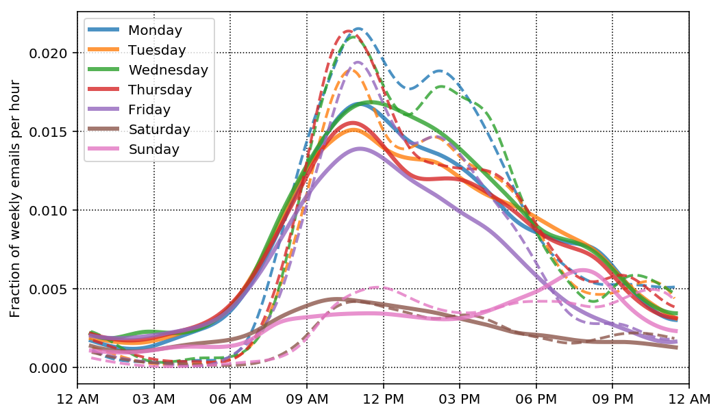
Ok, so the plot above is a little messy but lets try to make sense of it. We are plotting the fraction of weekly emails per hour, so if you summed up the values for the incoming mail curve on Wednesday you would get back the weekly fraction in the first bar plot above. The solid lines are for incoming mail and the dashed lines are for outgoing mail. Overall we wee similar trends as before with a tighter distribution around 8 - 6 for outgoing emails and a broader distribution for incoming emails.
As I hypothesized above, the Friday and Sunday counts are lower because I don't send or receive as many emails later in the day on Friday, and conversely, I receive and send more emails later in the day on Sunday. It is also interesting that my weekend emails (both incoming and outgoing) are pretty similar up until around 3:30 - 4:00 pm on Sunday where the emails start to pick up again.
What am I emailing about?
There are plenly of awesome sophisticated things one could do with email text but for fun, lets just make a word-cloud of the subjects to try to get a base idea of what I"m emailing about.
Lets remove the arxiv mailing list since that will contaminate our word clout with a bunch of email list boilerplate.
# remove arxiv emailers
df_no_arxiv = df[df['from'] != 'no-reply@arXiv.org']
text = ' '.join(map(str, sent['subject'].values))
# Create the wordcloud object
stopwords = ['Re', 'Fwd']
wrd = WordCloud(width=480, height=480, margin=0, collocations=False)
for sw in stopwords:
    wrd.stopwords.add(sw)
wordcloud = wrd.generate(text)

# Display the generated image:
plt.figure(figsize=(15,15))
plt.imshow(wordcloud, interpolation='bilinear')
plt.axis("off")
plt.margins(x=0, y=0)

So you can see that there is still quite a bit of planning with words like "telecon" and "tomorrow", "meeting" but it is pretty clear that I work in a collaboration called NANOGrav and having telecons and meetings are a big deal. We also deal with "data" a lot and I do a lot of "noise" analysis.
More personal analytics
This was the first post in a planned series of personal analytics. Next I plan to map out my google maps data over the years and I also plan to dive into 2 years of Fitbit data. Stay tuned!
Leave a Comment